Build a responsive pricing card as a reusable component
Built a responsive pricing card in Figma using Auto Layout and Component Variants: a vertical Auto Layout frame with a feature list and CTA, the button turned into a component with Default / Hover / Disabled variants, then duplicated into a three-card row that swaps variants of the same shared component.
Steps591
Duration9m 39s
Deliverables2
Rubric checks6
591 steps
Timeline · action type by step
001148296443591
←/→ step · space play
Build a responsive pricing card as a reusable component
Build a pricing card using Figma's Auto Layout and Component Variants, not static boxes and copy-pasted duplicates.
- Create a frame named PricingCard, 320×400, using Auto Layout (vertical), with specific padding (e.g. 24px all sides) and item spacing (e.g. 16px).
- Inside it, add: a plan-name text, a price text, a 3-item feature list (each item its own Auto Layout row with a checkmark icon + label), and a CTA button.
- Turn the button into a Component with three Variants: Default, Hover, and Disabled, each with a distinct fill/text color, all part of one component set.
- Set each PricingCard's resizing so it flexes inside the row: horizontal resizing = Fill container, vertical = Hug contents. (In an all Auto Layout design there is no separate "Constraints" panel; the Fill / Hug / Fixed dropdowns next to W/H are the equivalent.)
- Duplicate the card twice into a horizontal Auto Layout row named PricingRow (Basic / Pro / Enterprise), and each card should swap in a *different variant* of the *same* button component, not an independently-styled copy.
- Name every layer sensibly, with no "Rectangle 14" or "Frame 82" left in the tree.
Deliverable · captured from the machine
figma-file.jsoninspect ↗
{
  "document": {
    "id": "0:0",
    "name": "Document",
    "type": "DOCUMENT",
    "scrollBehavior": "SCROLLS",
    "children": [
      {
        "id": "0:1",
        "name": "Page 1",
        "type": "CANVAS",
        "scrollBehavior": "SCROLLS",
        "children": [
          {
            "id": "2:58",
            "name": "PricingRow",
            "type": "FRAME",
            "scrollBehavior": "SCROLLS",
            "children": [
              {
                "id": "1:2",
                "name": "PricingCard",
                "type": "FRAME",
                "scrollBehavior": "SCROLLS",
                "children": [
                  {
                    "id": "1:3",
                    "name": "Basic",
                    "type": "TEXT",
                    "scrollBehavior": "SCROLLS",
                    "blendMode": "PASS_THROUGH",
                    "fills": [
                      {
                        "blendMode": "NORMAL",
                        "type": "SOLID",
                        "color": {
                          "r": 0.0,
                          "g": 0.0,
                          "b": 0.0,
                          "a": 1.0
                        }
                      }
                    ],
                    "strokes": [],
                    "strokeWeight": 1.0,
                    "strokeAlign": "OUTSIDE",
                    "absoluteBoundingBox": {
                      "x": 24.0,
                      "y": 24.0,
                      "width": 31.0,
                      "height": 15.0
                    },
                    "absoluteRenderBounds": {
                      "x": 25.05681800842285,
                      "y": 27.0,
                      "width": 28.780183792114258,
                      "height": 9.15340805053711
                    },
                    "constraints": {
                      "vertical": "TOP",
                      "horizontal": "LEFT"
                    },
                    "layoutAlign": "INHERIT",
                    "layoutGrow": 0.0,
                    "layoutSizingHorizontal": "HUG",
                    "layoutSizingVertical": "HUG",
                    "characters": "Basic",
                    "characterStyleOverrides": [],
                    "styleOverrideTable": {},
                    "lineTypes": [
                      "NONE"
                    ],
                    "lineIndentations": [
                      0
                    ],
                    "style": {
                      "fontFamily": "Inter",
                      "fontPostScriptName": null,
                      "fontStyle": "Regular",
                      "fontWeight": 400,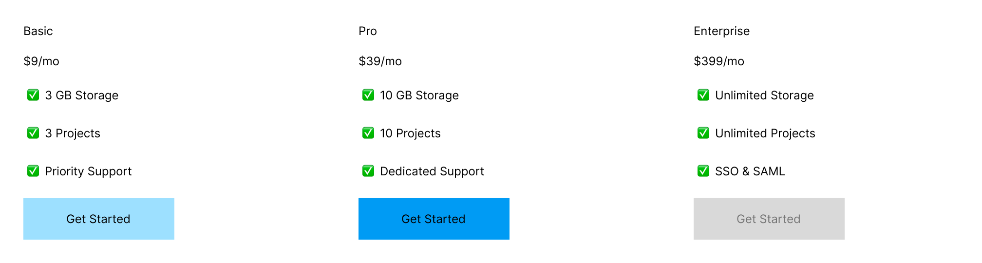
pricing-row.pngdownload ↓
- ✓PricingCard frame exists with Auto Layout (vertical) and specific padding/item spacing
- ✓Card contains a plan name, price, a 3-item feature list, and a CTA button
- ✓CTA button is a Component with 3 Variants: Default, Hover, Disabled
- ✓PricingCard resizes sensibly inside PricingRow (horizontal resizing = Fill container, vertical = Hug) -- in an all-Auto-Layout design this is the resizing dropdowns, not a Constraints panel
- ✓PricingRow contains 3 card instances, each referencing the same shared button component -- not independently-styled duplicates
- ✓No default-named layers remain (no Rectangle NN / Frame NN style names)